For those of you who might be interested, Heavenly Monkey updated their Book descriptions, so there is additional information into how the Lovecraft book is made. Quoting from their site:
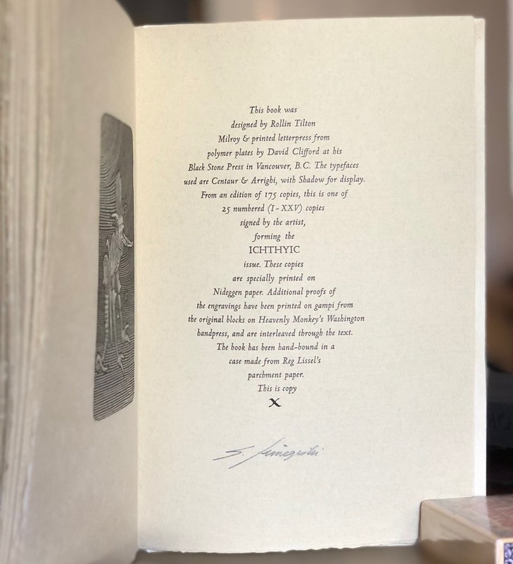
"Ichthyic (25 copies, I-XXV, with the imprint Heavenly Monkey) printed on Nideggen, a laid sheet suitably tinted for the story's abyssal theme. These were hand-bound at the Heavenly Monkey studio: sewn on black vellum slips and laced into a traditional limp case made from a handmade abaca-based paper with the texture and look of vellum. The case is lined with a sheet of handmade cotton paper that has had a large linocut printed on the front, the title on the spine, and our press device on the back. These can be seen through the semi-transparent paper case, to greater or lesser degrees, depending on how it is held. This issue also includes proofs of the engravings printed from the original blocks on handmade gampi paper, interleaved through the text, with the colophon signed by Shinsuke Minegishi. Seven of these copies (two hors commerce) had the proofs hand colored by the artist; these were sewn on purple vellum slips. With a black paper slipcase on which the title and lincout have been printed in black."
-
Stunning photos. I'm thrilled to hear that it grew on you! But if your wife starts complaining about your walleyed stare or malodorous abyssal reek, you'd better get rid of the cursed thing! I'll volunteer myself to jump on the grenade and take it off of your hands before harm is done. I'm a good friend like that.Leave a comment:
-
That�s really something � amazing to see what a piece of art a book can become in the right hands.Leave a comment:
-
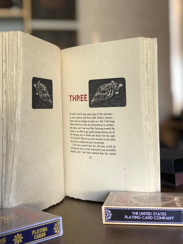
Shadow Over Innsmouth
In response to the "Your Holy Grail" thread, I am posting a lot of pics of one of mine. This is the ICHTHYIC edition of Lovecraft's Shadow Over Innsmouth from Heavenly Monkey (number X of XXV). As one person on this forum can probably attest, my initial reaction to this book was a bit hesitant. But I have grown to appreciate its many charms and its one of my favorites in my collection.
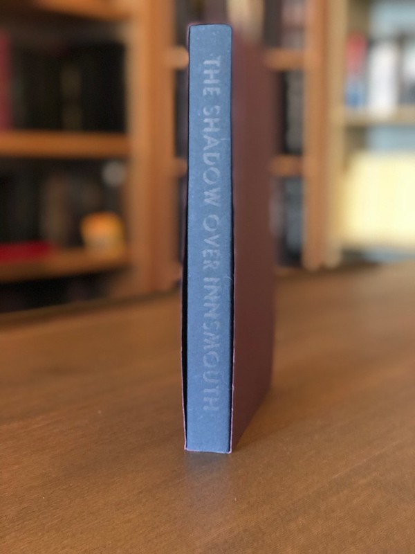
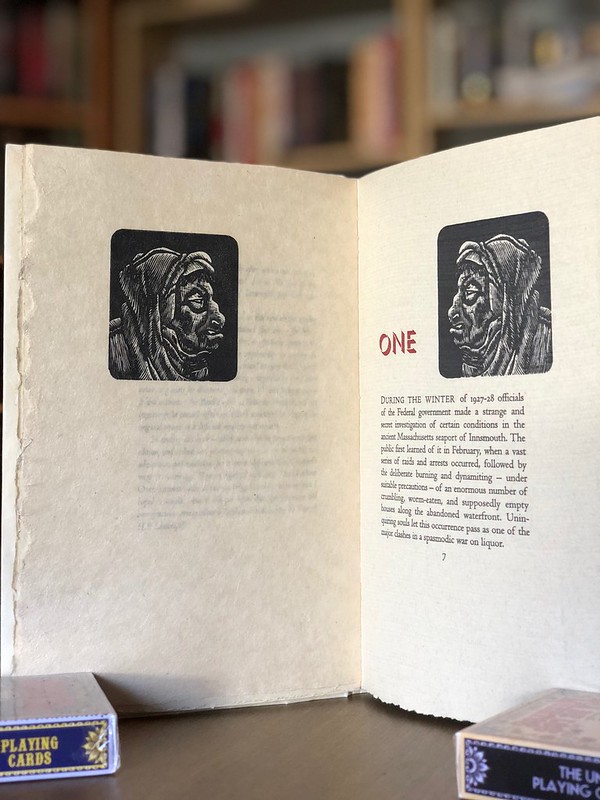
Its structure and casing are different from any book I have owned before or since. The casing is made of of a parchment paper. The printing on the cover and spine are underneath the outer layers of the casing, but somehow a part of it all. The quality of paper and printing on the inside are exquisite.
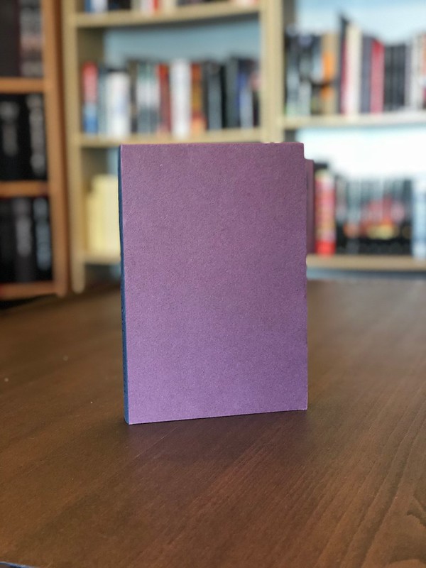
The book is slipcased in two paper cases, the outermost being purple with no printing on it, leaving the spine and fore-edge of the black inner case exposed. The black inner case has printing on the spine and the cover image of the book on the front.
I finally have a camera that can reasonably capture some of the details of this book. It's not an easy book to photograph. Hope you find this interesting:
In the slipcases:
Outer case removed, inner case still on:

Spine and front of the actual book, after the cases have been removed:
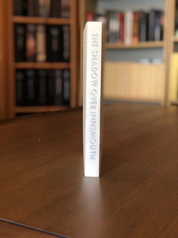

Some shots of the paper. I'm a sucker for interesting paper choices:

Finally, some interior shots:
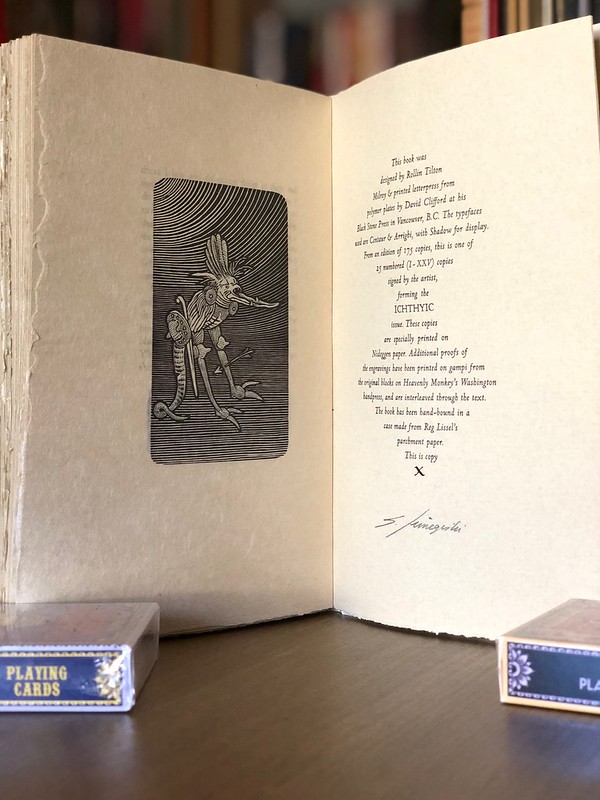
Close up of the colophon:
Leave a comment:
-
Dave, any idea who that third signature is from on the CP limitation page? My Limited has it, as well, but according to the page it's only supposed to have two, Moser and McGrath. Gogos only signed the deluxe, not the Limited. And that third sig (at the bottom) doesn't look like any of the above three anyhow. Any idea or is it another Centipede Mystery Special?Leave a comment:
-
Thank you Brian, Ron, and Theli for the kind words. The Centipede edition wins hands down in terms of content and completeness, but I really do love the Hand & Eye. The choice of paper in the Hand & Eye is exquisite and the artwork is lovely. I wish I had a better way of conveying more about the paper in photos.Leave a comment:
-
Thanks for the comparative pictures. It's hard to pick a prefered edition. Both look fantastic. I love the paper and font in the Hand and Eye edition, the limitation sheet is very sharp and clean too. The CP edition is really grandiose though, much nicer endpapers too. Both have stunning art.Leave a comment:
Leave a comment: