Truly an inspiring piece of craftsmanship.
-
-
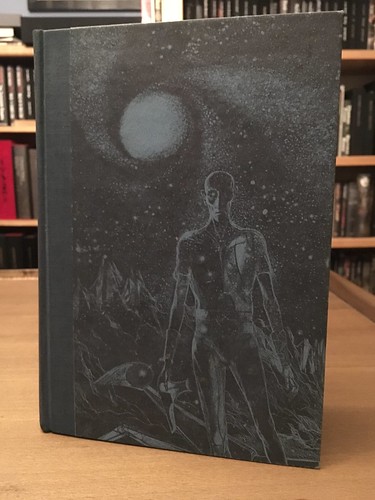
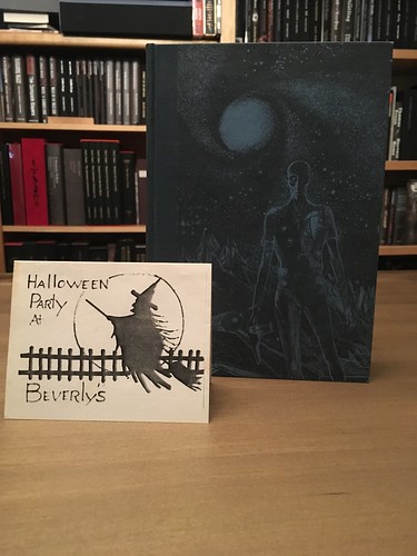
My wife was given her uncle's personalized 1974 Heritage Club edition of Bradbury's "The Martian Chronicles". This one joined our collection this past week. Inside the book, we found the corresponding newsletter from the Heritage Club and invitation to someone's Halloween party.
Cover:
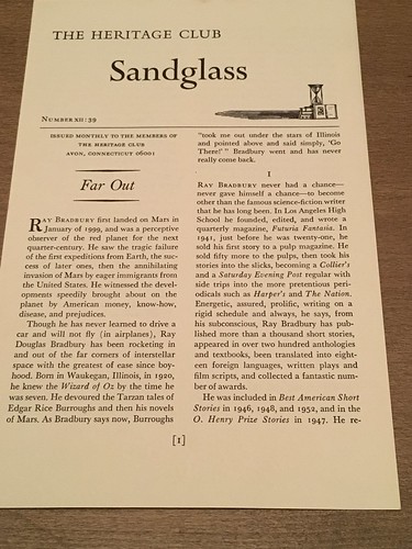
Look what we found inside!
Nice inscription from Bradbury:

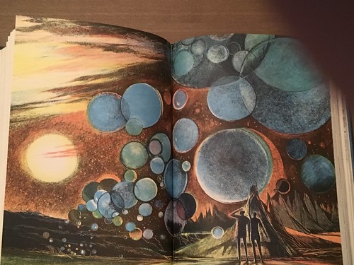
Interior shots:
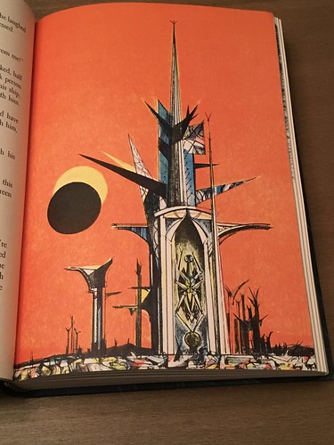

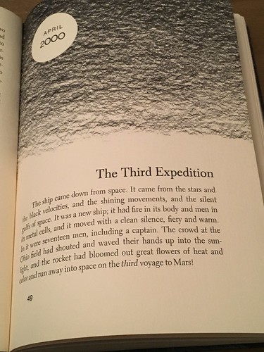
Yeah, I thumbed this one a bit:
Comment
-
Excellent and I Love the Halloween invitation!Comment
-
This is so awesome and amazing. I am so jealous. Very nice.Originally posted by daverob View PostComment
-
Thank you! I have to say that I haven't been a huge fan of the style of art used in the Bradbury book, mostly because so much work in this style uses color palettes that just aren't to my liking. But the work in this printing really pops. I was surprised how much I liked it.Comment
-
It really is quite the outstanding edition and quite the nice gift! I dig the art quite a bit. The Martian Chronicles was the first Bradbury I read many moons ago when I was in high school.Comment
-
Very nice!Comment
-
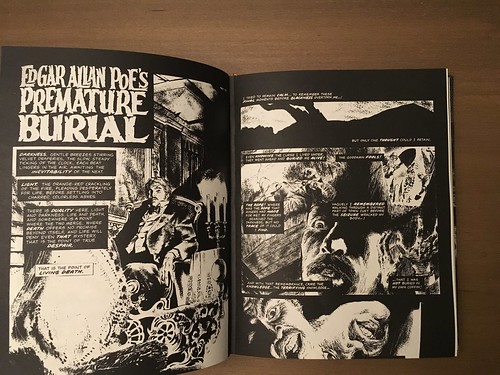
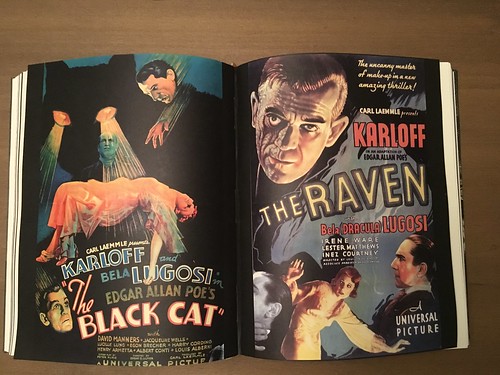
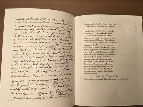
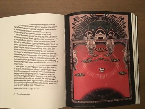
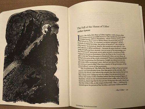
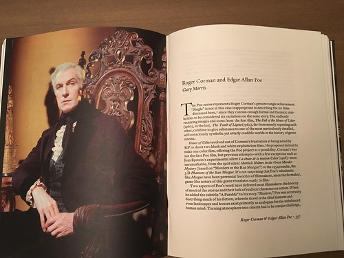
Some pics from Centipede Press' Edgar Allan Poe The Man That Was Used Up.
Front cover, spine, and back cover


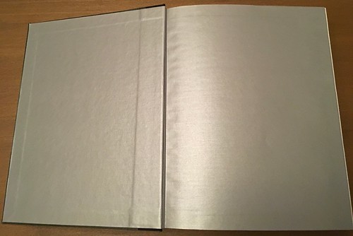
Endpapers:
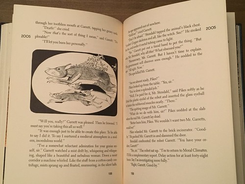
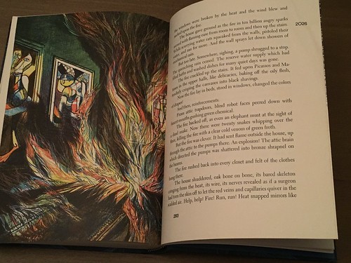
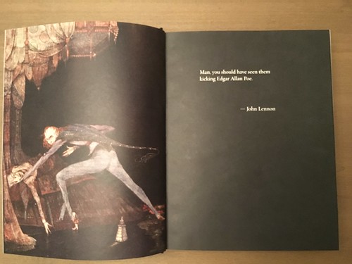
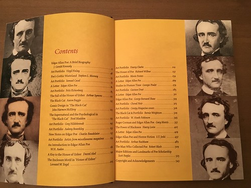
Interiors:

Comment
-
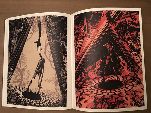
...and a few more pics:

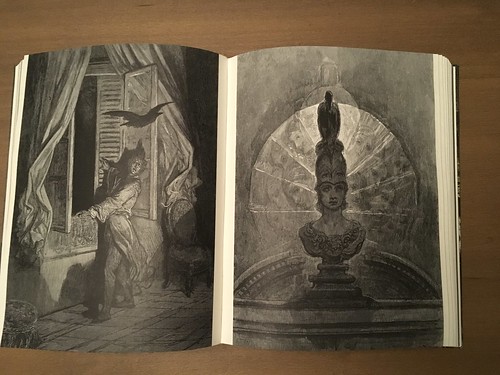
This pic has a pinkish tint to it. The fault is mine. It's not the book...

Comment
-
Another fantastic edition from Centipede Press.Comment
-
Oh man, that's one I've been after for a long while. A big congrats (even as I seethe with jealousy ;-)). Those pics make it looks as good as I'd always imagined.Twitter: https://twitter.com/ron_clintonComment
-
Looks like an amazing book. Even better than the usual from CP. Great pics too!Comment
-
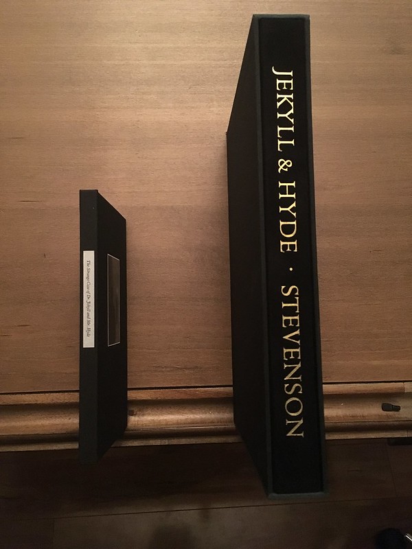
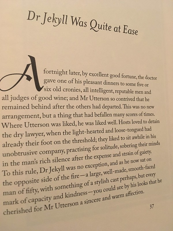
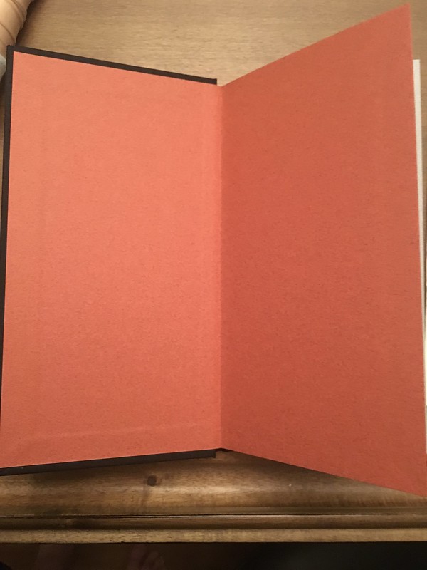
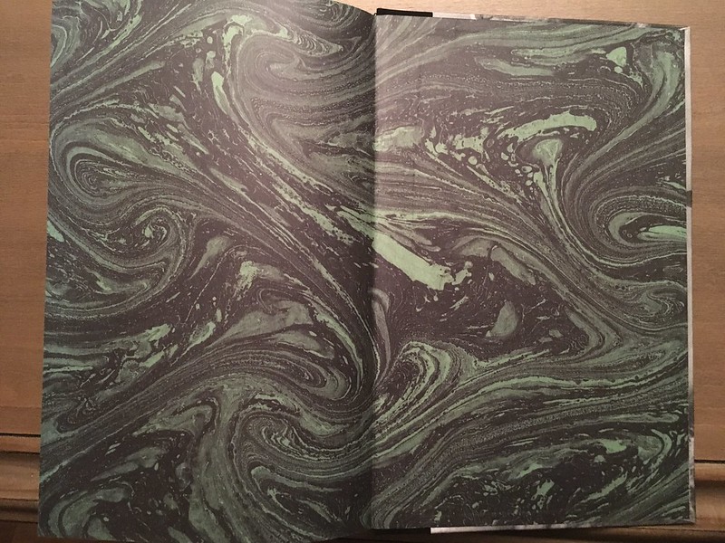
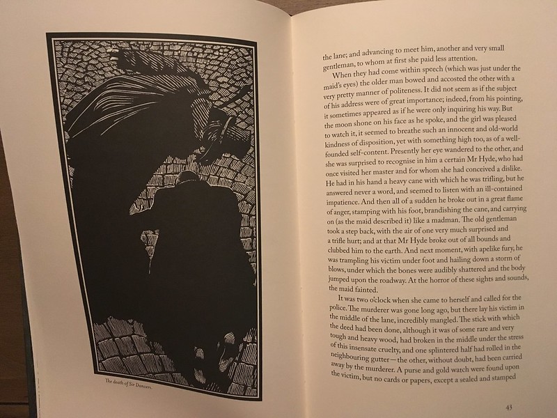
I like to compare how different designers/publishers approach the same work. Here's a look at two different editions of Dr Jekyll and Mr Hide. The edition on the left is from Hand & Eye Letterpress (who went small for their edition) and on the right is the Centipede Press edition (who went big). I admire them both for different reasons. The Hand & Eye has been on my list for quite, so I was quite happy to finally track one down.

Hand & & Eye does not have a slipcase, while Centipede does:
A text sample from Hand & Eye:

The same text from Centipede:
Hand & Eye endpapers:
Centipede endpapers:
Hand & Eye limitation and sig sheet:


Centipede limitation/sig sheet

Comment
-
Some of the artwork from Hand & Eye


and some from the Centipede edition:

Comment
-
Those are both fantastic editions. Love the comparative views.Originally posted by daverob View PostComment
Comment